
【CSS】「fixed」と「sticky」を使って要素を追従させる方法

サイトを閲覧しているユーザーが別のカテゴリーやページに行きたいときに、ヘッダーメニューがあると便利です。
しかしヘッダーメニューは通常スクロールすると隠れてしまい、もう一度うえにスクロールして戻るのは不便です。それを解決するためにヘッダーを追従させてユーザーの利便性を高める方法を2通り紹介します。
今回は
- position: fixedを使ってヘッダーを追従させる方法
- position: stickyを使ってヘッダーを追従させる方法
を紹介したいと思います。
position: fixedを使ってヘッダーを追従させる方法
ヘッダーを追従させるにはCSSにposition: fixedかposition: stickyを使います。まずposition: fixedを使ったパターンのサンプルコードを用意ました。
See the Pen 固定 header by teru (@teru241546) on CodePen.
HTML
<!DOCTYPE html>
<html lang="ja">
<head>
  <meta charset="UTF-8">
  <meta http-equiv="X-UA-Compatible" content="IE=edge">
  <meta name="viewport" content="width=device-width, initial-scale=1.0">
  <link rel="stylesheet" type="text/css" href="/css/style.css">
  <title>DEMOCODE</title>
</head>
<body>
  <header>
    <div class="header">header</div>
  </header>
    <div class="mainvisual">
      <img  src="https://drive.google.com/uc?export=view&id=1tghEB4fQhkXIXMWOeBtuLJnOxNygRZzj" alt="トップイメージ">
    </div>
  <main>
    <section>
      <h2>見出し</h2>
      <p>テキストテキストテキストテキストテキストテキストテキストテキストテキストテキストテキストテキスト</p>
    </section>
    <section>
      <h2>見出し</h2>
      <p>テキストテキストテキストテキストテキストテキストテキストテキストテキストテキストテキストテキスト</p>
    </section>
    <section>
      <h2>見出し</h2>
      <p>テキストテキストテキストテキストテキストテキストテキストテキストテキストテキストテキストテキスト</p>
    </section>
  </main>
<footer></footer>
</body>
</html>
CSS
/* ここからリセットCSS */
html, body, div, span, object, iframe,
h1, h2, h3, h4, h5, h6, p, blockquote, pre,
abbr, address, cite, code,
del, dfn, em, img, ins, kbd, q, samp,
small, strong, sub, sup, var,
b, i,
dl, dt, dd, ol, ul, li,
fieldset, form, label, legend,
table, caption, tbody, tfoot, thead, tr, th, td,
article, aside, canvas, details, figcaption, figure,
footer, header, hgroup, menu, nav, section, summary,
time, mark, audio, video {
margin:0;
padding:0;
border:0;
outline:0;
font-size:100%;
vertical-align:baseline;
background:transparent;
list-style: none;
}
*,
*::before,
*::after {
box-sizing: border-box;
}
img {
vertical-align: bottom;
}
a {
display: block;
color: inherit;
text-decoration: none;
}
/* ここまでリセットCSS */
header {
background: #333;
color: #fff;
padding: 32px 0;
position: fixed;
width: 100%;
}
.header {
text-align: center;
}
h2 {
font-size: 24px;
text-align: center;
margin: 60px 0;
}
p {
text-align: center;
max-width: 500px;
margin: 0 auto;
}
.mainvisual {
max-width:900px;
margin: 0 auto;
}
img {
width: 100%;
height: auto;
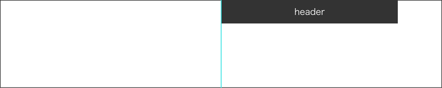
}ポイントはheaderタグに設定したposition: fixedです。これを指定してあげるだけで要素が浮いた形になり、要素が固定され画面をスクロールしてもヘッダーが追従してくれます。
ただposition: fixedを指定するとその下にあった要素が下に潜り込んだ状態になります。上のサンプルでは画像がヘッダーに隠れてしまい時計の部分が見えません。
これを回避するために下の画像要素にヘッダーの高さの分だけmargin-topを指定し、ヘッダー自身にはtop: 0を付け加えてあげる必要があります。
See the Pen 固定 headerーマージントップ by teru (@teru241546) on CodePen.
またposition: fixedを指定するとデフォルトのwidthがその要素の最小幅になってしまうので、指定してあげる必要があります。ヘッダーをブラウザ幅いっぱいにする場合は、width: 100%かleft: 0とright: 0の両方を指定してあげることで解決できます。
仮にヘッダーの幅をpxで指定し中央に配置したい場合、marginが効かないのでヘッダーの指定は以下のようにします。
header {
    background: #333;
    color: #fff;
    height: 80px;
    line-height: 80px;
    position: fixed;
    width: 500px;
    top: 0;
    left: 50%;
    transform: translateX(-50%);
}
ポイントはleft: 50%;とtransform: translateX(-50%);を両方指定してあげることです。
まずleft: 50%;で要素をブラウザの中央に配置します。このときヘッダー要素の左端がブラウザの中央に位置することになります。
次にtransform: translateX(-50%);と指定し、要素の長さの半分だけ左にずらしてあげます。
こうすることでヘッダー要素を中央に配置することが可能です。
position: stickyを使ってヘッダーを追従させる方法
続いてposition: stickyを使った方法を紹介します。こちらの手法の方が比較的簡単だと思います。先ほどのfixedとほとんど一緒ですが違いもあります。
See the Pen 固定 header-sticky2 by teru (@teru241546) on CodePen.
CSS
header {
background: #333;
color: #fff;
height: 80px;
line-height: 80px;
position: sticky;
top: 0;
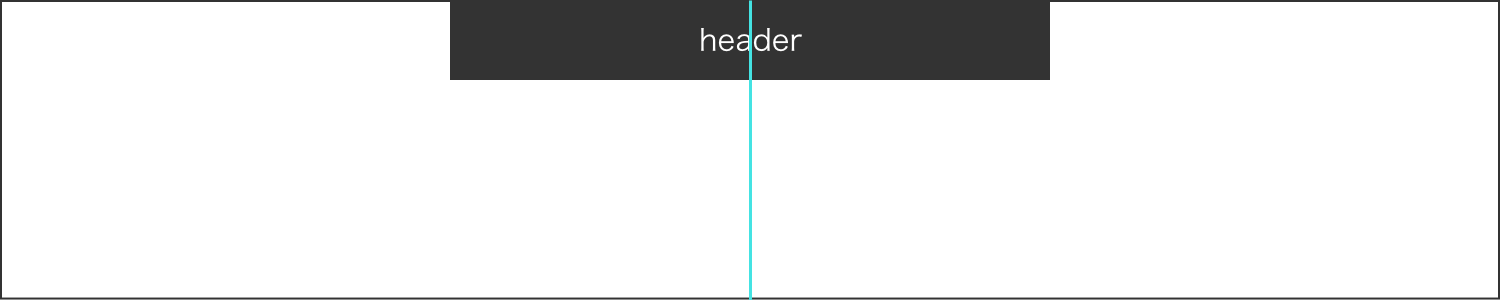
}position: stickyはtop: 0など位置を指定あげないとうまく作動しません。widthに変化はないので、必要がなければそのままでも大丈夫です。
左右中央配置したい場合はmargin: 0 autoで解決できます。
またposition: stickyは下の画像要素にmargin-topを指定しなくても重なって画像が隠れてしまうことはありません。
しかし、position: stickyは現在IEで非対応とのことですがIEは使用率が日本国内で2%ほどで、今後更に下がっていく傾向なので気にせず使っても問題ないと思います。
まとめ
fixedは使用した場合widthを指定してあげないと表示されない場合があり、stickyは指定してもwidthに変化はない。
fixedの場合左右中央に配置するにはleft: 50%、transform: translateX(-50%)を使用する。stickyはmargin: 0 autoで解決できる。
position:stickyはtopやbottomなど位置を指定してあげないと作動しない。
以上、固定ヘッダーについての説明でした。皆さんもよかったら使ってみてください。